
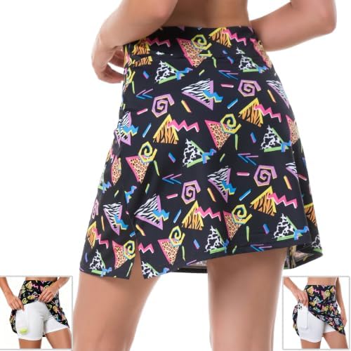
Setting lines of text beside your photograph
When you add words to a photo print, both share the same flat area on the piece. Shorter lines let us set larger type. Long sentences force the letters down in scale until they crowd the picture. Here is how we balance lettering across cloth, ceramic and metal surfaces.
The trade off between length and size
The basic rule on the press is direct. Short words can run tall and heavy. Long sentences have to drop down in size to fit within the edges of the print area. When lettering drops below a certain height, the eye skips it entirely from across a room. A single name or date can sit clear across the bottom of a throw without eating into the face beside it. A four-line message shrinks both the letters and the crop of the photo. If you want the picture clear, keep the text down to what someone can catch at a glance.
Where lettering runs into physical edges
Cloth moves and bends along stitched paths. When letters cross a pocket, a placket or a collar seam, the needle holes and thread breaks split the strokes apart. On metal drinkware or ceramic mugs, text wraps around the curve. Long lines force the reader to turn the cup in a circle to finish the phrase. On smaller goods like keychains or socks, the whole surface is compact. Shrinking a full sentence down onto a narrow strip leaves the letter forms fuzzy after the ink settles into the weave of the fabric.
Names versus full blocks of copy
A single name or a year works well because the eye takes it in alongside the image. A short line of three or four words still leaves room for a generous crop on the face. A full paragraph on a shirt or hoodie rarely gets read by anyone walking past. People look at the central photograph, spot the large letters, and move on. If you place a block of copy on cloth, the letters compress together. The print run loses clarity, and the piece ends up looking like a page from a manual.
Contrast against busy photographic backgrounds
Letters disappear when the background shifts between dark shadows and bright highlights. White type placed over dappled sun, tree branches or patterned shirts gets broken up by the background tones. Making the letters larger does not solve the problem if the contrast underneath them keeps changing. The working fix is finding a calm part of the image, such as an open sky or a plain wall, and placing the line there. If the whole photo is busy, cropping tighter gives the text a solid, uninterrupted corner to rest on.
Checking the layout from across the room
Before you send the artwork through to the queue, check the scale on your screen. Zoom out until the preview matches the physical size the piece will have when worn or held. Then take two steps back from your desk. If you have to lean forward or squint to tell what the words say, the line is too long or the type is too thin. Shorten the phrase until the words stay distinct at normal viewing distance. That check shows you what the printed piece will look like in actual use.
Short version
- Our catalogue holds 552 pieces across 14 sections sorted by the surface we print on.
- Shorter lines of text allow the printer to set larger letter forms across the piece.
- Lettering placed across stitched seams or plackets breaks the continuous line of the text.
- High contrast between the font and the photo background keeps letters readable from a distance.
- Blocks of small text shrink both the typography and the available crop area for photos.
Keeping words readable on the press
A photo and a line of text have to divide the same printable space. Choosing fewer words gives the picture room to breathe and lets the lettering stay crisp. Place your text over an even background and keep the line short enough to read from a few paces away.
From this section
Pieces this note is about
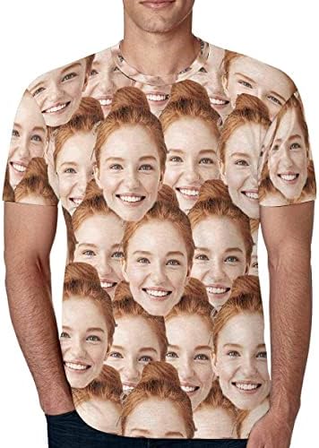
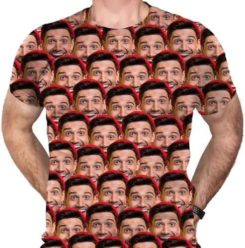
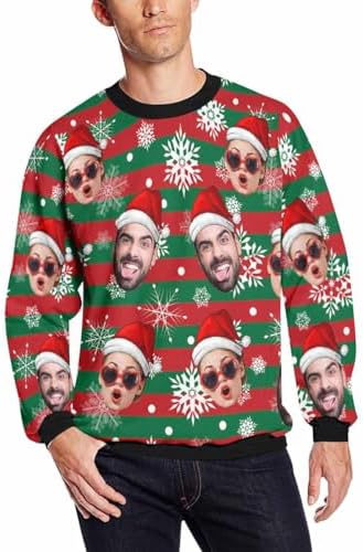
Tees & Everyday Wear holds 55 pieces. These four get ordered most.
Keep reading
Other notes from the bench
Bench notes
Why the surface decides the print
We sort our catalogue by the material we print on, because cloth, metal, and acrylic treat a photograph differently.
Artwork notesCropping a face for the bench
Personalisation is ink on a surface, not sorcery.
Outdoor notesPrinting outdoor pieces for the yard
Outdoor printing has to work against sunlight, rain and distance.